Whether you like it or not..... or think it works..... I'd be interested to know.
Saturday
At Hidcote....


At Kiftsgate


Someone enjoying cake....


Sunday
At Bourton House Garden


At Upton House


At Broughton Castle


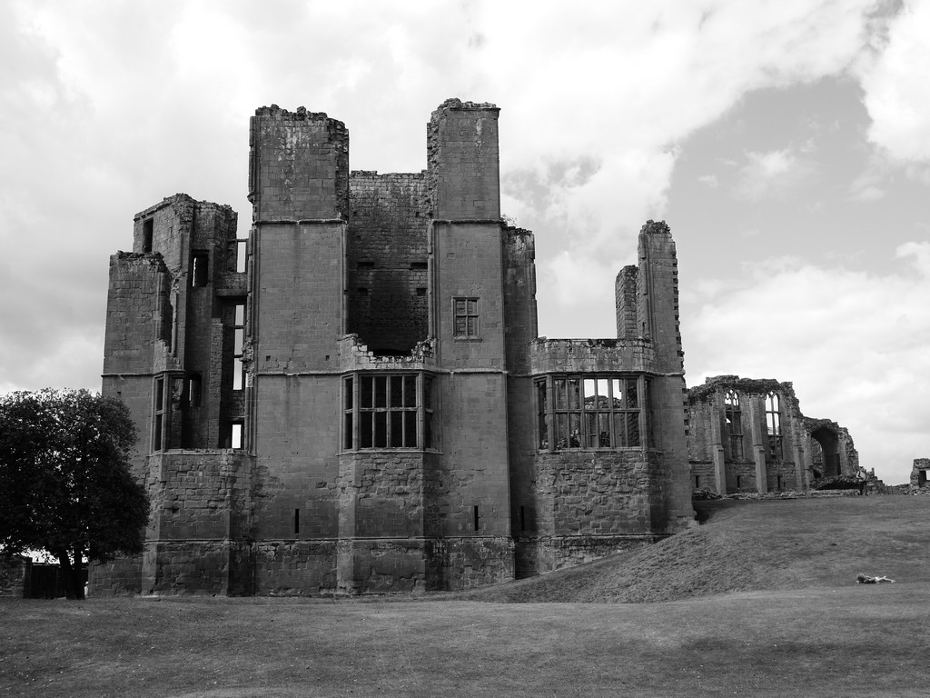
Monday
At Kenilworth Castle


At Charlecote Park


Tuesday
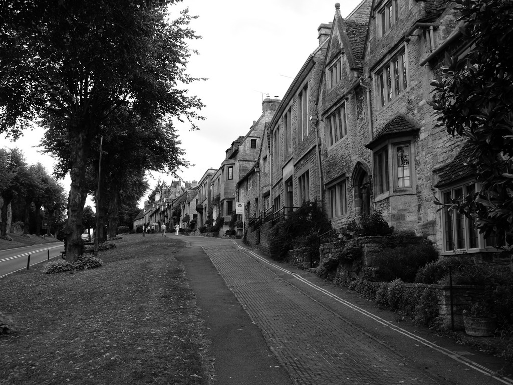
At Bibury


At Fairford


At Burford


At Lower Slaughter


9 comments:
Perhaps you could give us a clue as to what your goal is in converting your color photos to black and white. I have a poster of Ansel Adams' The Tetons & the Snake River which would lose its majesty if it were in color.
goal? well I like the look of B&W I think it gives the photos a totally different atmosphere and perspective
do you not agree?
I'm intrigued what people think works and doesn;t
I ought to add that none of these were converted. The colour photos were mostly with the Nikon dSLR. These are JPEGS with the camera (GF1) set in B&W mode
You still havent indicated why you might prefer them in black and white. I have to tell you I do not like them at all. Over time you have had some remarkably beautiful shots. I still remember one of girls picking pears etc which was v reminiscent of early photography. Yu make England very special. Your composition is often interesting. How about getting a large format camera on a tripod and shooting black and white film? When you have it developed, you can get it on digital files.
I like the black and white Pete. I think in some cases you can get a far more atmospheric picture.
Although I think bandw works best with buildings, statues etc., my two favourites out of your selection are among the first group - the tap amongst the ferns and the watering can.
I'll have to experiment as the few of mine I've done in bandw - I've converted from colour with software. I must have a go by taking the photos in bandw mode and comparing the 2 methods.
turquis, sorry you don't like them. I find B&W atmospheric. as to why I just think it gives a different view. The two girls in the water towards the end works better in B&W than in colour
I shoot for myself and if it gives others pleasure great, if not? well its for me!
my fave photo is one of dad this year in B&W at Lavenham.
trust me a large format camera isn't happening! i like portability. i usually have binoculars and a book with me so...
PS Girl with pears? me???
Caroline - i tend to agree with you.
For me some of these work very well and some don't. I'm not sure that flowery borders are enhanced by using B&W but certainly the pictures with more angular lines (or still life) lend themselves really well.
I particular I like the watering can shot,and the 2 girls in the river work well - as does the church spire reaching for the sky.
I am going to partially agree with Turquis on this one. Having said that, some are OK. My first impression is that some lack contrast, and this is probably because you've let the camera do the conversion rather than converting it later.
In actual fact, you still have an RGB image - it's not pure black and white (or greyscale), but because you set the B&W in-camera, you have lost the colour information. Had you shot in RAW you would still be able to see colour in the image-editing software (as long as it reads RAW files - e.g. Adobe Camera Raw), but you would still view as B&W on your camera monitor when you take the shot, because that only shows the associated jpg, not the actual RAW file.
If you shoot in colour, and then convert later to B&W you can make more precise adjustments so that you can get more contrast and better conversions.
I found the following links, which you may find interesting:
http://www.thedphoto.com/photography-techniques/in-camera-black-and-white-photography/
http://www.northlight-images.co.uk/article_pages/intro-digital-black-and-white.html
I'm going to have a play with the tap and watering can images and see what I can come up with.
Also, there has to be a purpose to having an image in b&w - they don't all suit the conversion.
I like the portraits - including the past ones you've done of your dad, and the one of Tricia wolfing cake is quite good. It tells a story and the eye is concentrated on her and not the background, which is nicely diffused.
The one at Bibury, however, is not so good. The eye is drawn to the lady on the left background and the trailing piece of what looks like material from the canopy and T is in darkness. If you wanted a portrait, the background needs to be more blurred. Or if you want the whole scene as well, you need to eliminate distractions so that the eye is led to the main subject.
right the one at Bibury. I didn't have time to set that up! She unknowingly posed for the cake shot and I had time to set a fast aperture :D I should have cropped it more though.
the reason for shooting in B&W is often to make me think. I will admit these are only partially successful.
For me it was an exercise in seeing what worked and what didn't.
I think townscapes and portraits work. and i think the building shots. I do like the one of the girls in the river.
the garden ones are hit and miss.
and yes the tap for instance needs more contrast!
hey ho.
Post a Comment